Tucked away in a bottom drawer of my file cabinet, I pulled out a “Visor Neo†by Handspring. If you were a fan of the original Palm OS and the year was 2001, then this was the cat’s pajamas and you were a cat getting ready for bed.
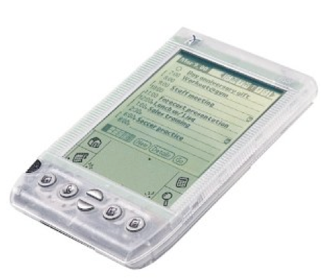
Hello beautiful. The cases the Visor Neo shipped with were uniformly semi- translucent, allowing the owner to gaze upon the technology within.
Hello beautiful. The cases the Visor Neo shipped with were uniformly semi- translucent, allowing the owner to gaze upon the technology within.
Released in the spring of 2001, this device contained:
- Processor: MC68VZ328 DragonBall processor clocked at 33 MHz.
- Memory: 8 MB DRAM
- Expansion: Handspring’s standard Springboard Expansion Slot.
- Display: 160×160-pixel, 4-bit grayscale (16 shades of gray) display.
- Power: two AAA batteries that would last up to two months.
- Communications: via infrared port Price: $300
Judging by the processor’s moniker I’m guessing that 2001 was a simpler time for mobile hardware vendors, less competition to be had, and perhaps a bit more fun.
As you slowly turn this device over in your hands you can’t help but marvel at how far we’ve come in the last 10 years. The included “expansion slot†is a wonder, a huge maw of copper teeth waiting for some kind of plugin card that sadly have all been thrown away long ago. Two AAA batteries sit snugly in the bottom of the device looking completely out of place in this lithium-ion powered world. While I was busy dusting this little guy off, not three feet away, sitting on smugly on my desk, was a 5th generation iPod touch. Two very different universes colliding in my office… and my office barely has enough room for one universe.
The current base model iPod touch device contains:
- Processor: Apple A5 800 MHz (2 cores)
- Memory: 512MB / 32GB
- Display: 1136×640 – 18-bit color (24-bit emulated)
- Power: Lithium-ion polymer battery
- Communications: WiFi 802.11n / Bluetooth
- Price: $300
We are talking about massive, mind bending changes here in terms of device capability. I’m thinking of the original Wright Brother’s flyer, parked next to one of those giant city destroying saucers from “Independence Dayâ€. No offense to Apple intended.If your are still reading and starting to wonder if there’s a point to this article, I’ll try to spring it on you here.
Ready?
Ok, here we go:
Over the last 10 years, Media-X has needed to release the same basic application on BOTH of these devices. I’m looking at you eWalk.
Think about that for a moment. Better yet, take a look at this fancy graphic I made below, and THEN think about it for a moment:
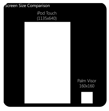
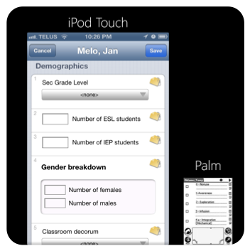
We’ve gone from having to cram an interface onto an 160 x 160 pixel, grey scale screen to a device that has a 1135 x 640 pixel and can represent any color you might dream up, in any shade you’d prefer. You might think to yourself that this might be a good deal for any programmer / company. A bigger screen, faster device – this must be a lot easier to develop for, right?
Well, sorta. Well no… It depends.
Yes, it’s wonderful to have modern, reliable wireless communications and yes it is fantastic that these new mobiles are so mind meltingly fast and have 7529 times the amount of active memory than the original voyageur space craft. (thank you Wikipedia, I love you dearly.)
But here’s the thing…
Developing for the older handhelds in last decade was along the same lines as being committed to an institution for a (long) number of years. The restraints and the small spaces are difficult at first but give them time they start to feel almost comforting. Confronted with the open sky of one of these modern devices, an “old school†designer just might end up curled up on a tight ball in some forgotten corner of the development wing, muttering to him or herself about scaling graphics, landscape mode and the accursed art department.
Here at Media-X I’d like to think that we’ve successfully pulled off a very nice transition from going from the Palm to the newer iOS, Android and soon (…don’t tell anyone, its a secret.) Windows 8 devices. What you see however, when you use our iPad application isn’t something that was created easily, thanks to a fancy processor and better graphics.
It was hard. No really, it kind of was…
We’ve invested thousands of hours thinking about how we can deliver the best mobile experience for our data collection applications like eWalk and eWalkPLUS. Moving from scroll wheels and stylus’s (stylii? Stylipie?) to fluid touch devices wasn’t something we just woke up, drank some coffee and “got done†one morning.
We’ve had some remarkable design meetings over the last decade as we’ve scrambled to come to terms with these hardware changes. Remarkable in terms of screaming and profanity.
There was some real pain involved along the way to getting where we are today.
Some examples:
Pages! The original eWalk was built almost entirely around the concept of pages, and why not? What a great idea! Good job everyone!
In fact, there used to be a restriction when adding your questions, a maximum of only five questions per page. Â That’s it.
Know why?
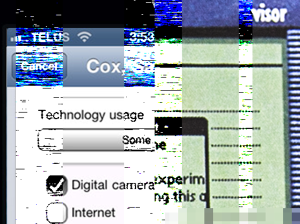
Early Palm and Pocket PC devices had crummy screens that we could only squeeze in 5 questions into per page. They also had lousy, or non-existent scrolling capabilities so you simply HAD to completely refresh the screen with new content. Imagine our surprise and deep torment when the iPhone came, a device that excelled at many things, one of which was: Scrolling. Man, that device loves to scroll and does it really, really well. Suddenly we had to totally rethink our interface and move/scramble away from fixed pages to a new concept involving a single, long, beautifully scrolling page. No more poking at page buttons!
Colors! You don’t need to spend a whole lot of time wondering about color schemes when your device only supports 16 shades of grey. Suddenly we had to become rainbow experts. This was painful, disorienting transition for some of the staff involved.
Cameras! I can proudly say that eWalk for the Palm, long before the iPhone was a twinkle in anyone’s eye, supported image capture via the built in camera that you could find on….. let me think a moment… a Zire 71? Yes. Back in the day, something along the lines of a Zire 71 could capture a 640 X 480 image and we (for a time) supported the ability to upload your images from the device to your web account. Fast forward to the latest iPhone, a device that can take pictures at a resolution of 3264 X 2448 pixels! We support image capture here as well and its fantastic, but I must admit, we had a few tense moments during development when we realized we were going from having to move and store images that were 33KB to images that were 75 times larger in size.
Our IT department loved working that one out.
Space! All that space…
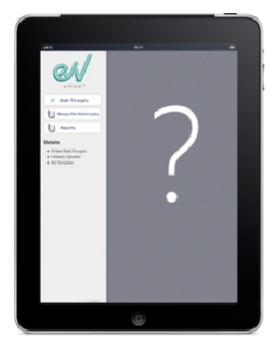
You might not readily guess it, but likely the biggest challenge we’ve faced moving to more expansive screens is dealing with the question of: “What are we going to do with all of this extra space?!†When you come from spending years cramming data onto tiny screens, this was a very new and unwelcome problem for us. For example, when we finished creating the main menu for our original eWalk app on the iPad, we were horrified to see a huge sea of grey, empty, void.
The five stages of developer grief were as follows:
Denial: “All that extra space is fine, maybe negative interface space is trendy this year?â€
Anger: “No, I don’t have any other suggestions! It’s not my fault they made the screen this big! I only have a couple of menu items, what do you expect from me?! No, I can’t make the icons any bigger!†<the sound of computer equipment being violently throttled.>
Bargaining: “Ok, maybe I can make the icons bigger. Ok, well, that didn’t work… Maybe if I add a bit more space between these menu items…â€
Depression: “There simply aren’t enough buttons in this world to fill this endless screen….I think I might be dead.â€
Acceptance: “Wait, maybe we can take advantage of this, lets call a meeting!â€
Luckily, for us, the whole adversity / opportunity dynamic kicked in at the last moment and out of the grey space has come some really wonderful innovation. We now have the live dashboard on the iPad, giving you access to instant reports on your data and this year we are rolling out something very new and very special in our 2.0 version of eWalk for iPad. I can promise you it will give you an entirely new, exciting way of interacting with your data.
To wrap things up, I’ll leave you with one last impression. About halfway through last year, Google unveiled a new project called “Google Glassâ€. This is a brand new mobile form factor, a pair of glasses that allow you to view a mobile screen and interact. While the rest of the world was busy oooing and awwing and imagining calling their friends with a flick of their eyes, up here in Ottawa, we took a deep breath and…. headed back to the whiteboard.